Heliocentric Climate Seasons- (HCS)
I realize this may be somewhat controversial as many feel, or are compelled to strongly encourage or ‘force’ the issue that the ‘science is settled’ regarding climate change or global warming or both. One thing is for sure, for a ‘science that is settled,’ our climate changes as often as the weather does. And that changes about as often as the name of ‘climate change’ or ‘global warming.’
BUT, I can’t help but notice and sense or experience real events in my life, and record them, or others have recorded them, that lead me to think and believe otherwise. This is a product of my own investigation, curiosity and study. No one or no company has paid me to do this.
This is a theory I’ve been working on for a while. It is by no means perfected or absolute. Someone else may have had a similar idea already. If they did, I couldn’t find it.
However it does offer another possible explanation to why our climate may change. Frankly, I haven’t seen anything like it but that is not to unequivocally state this hasn’t been floated elsewhere and proven or disproven, in some other name. If you have info or know of other similar research to this, please visit me on https://www.facebook.com/weatherwalrus and leave a comment there.
There is no question the climate is changing. Weather changes daily and the climate, the longer term pattern of overall weather changes too. There is no denying that. It appears to me the fundamental question is ‘what is causing this change?’ Is it anthropogenic, ‘man’ influenced or natural?
I have limitedly read about the Atlantic Multidecadal Oscillation and how it may affect climate. At the core of this, and as I understand the theory is based sea-surface temperatures, warmed by the heating of the sun. I’m sure there are other theories out there and there are many variables in this whole mixture of our atmosphere, including CO2 and other factors, that may or may not affect our temperature. But at the root of it all, in this theory and mine, appears to be the sun.
The Basic Idea of HCS
In my observations of weather with my own weather stations (wx stations), and experiencing the weather for the past 40+ years, there is an unquestionable and undeniable pattern in our day and year. The first pattern is easily recognizable daily as the sun comes up and goes down giving us a diurnal rhythm, via the spin of the earth on its axis. Each day on average, the temperature rises and sun gets higher in the sky and lowers as the sun goes down.
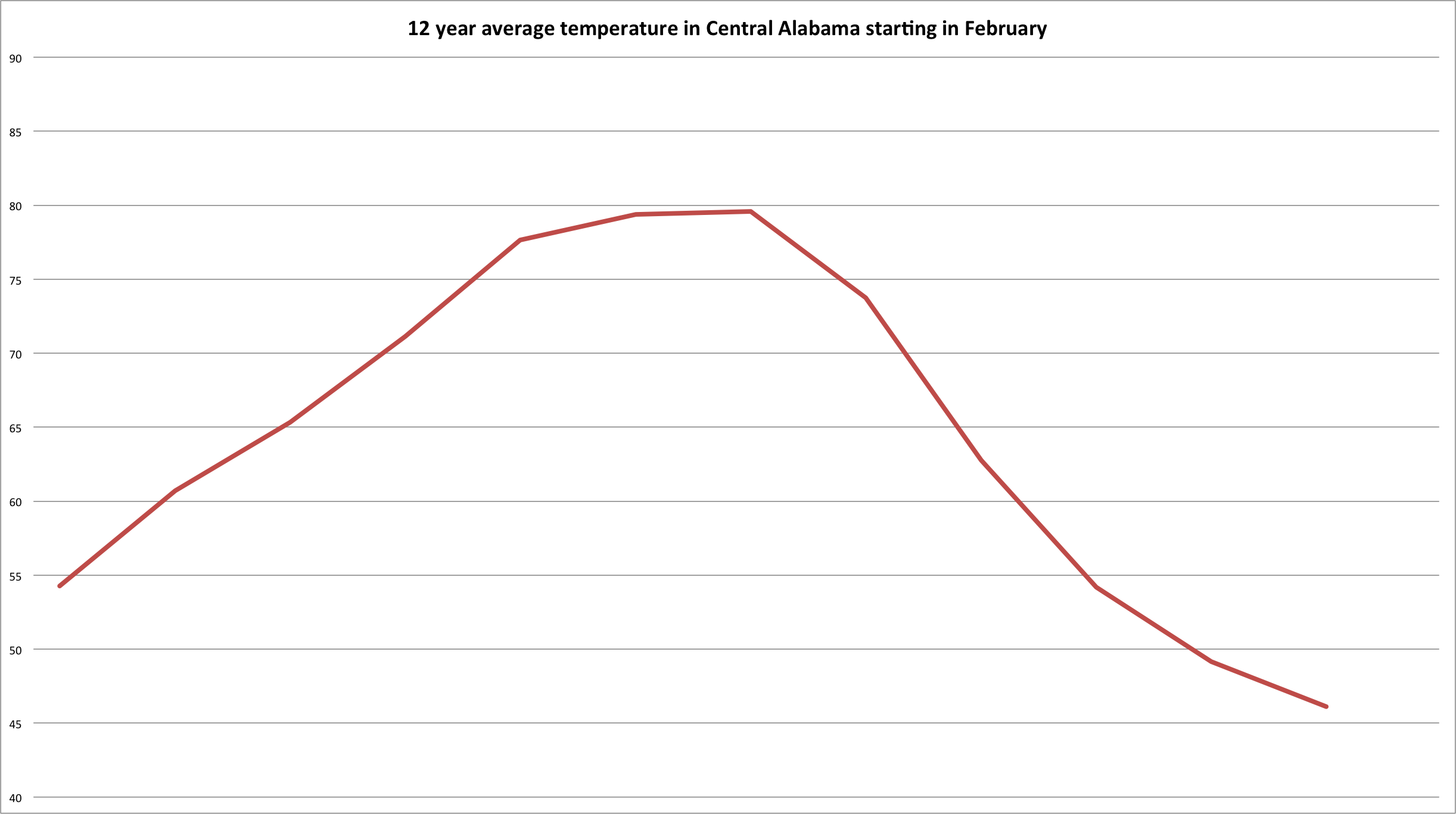
Central Alabama temperature graph for a year beginning in February
The second unquestionable pattern is noticeable in our year with the seasons, solstices and equinoxes. As the earth circles the sun throughout our year, the angle of the sun rises and lowers in the sky and directly relates to how much insolation or ‘incoming solar radiation’ occurs on the surface of the earth. And this tilt of the earth helps create our seasons, winter, spring, summer and fall. Then it happens all over again, kind of like our day…cool in the morning before the sun comes up, warms during the day, and when the sun goes down, it cools off again.
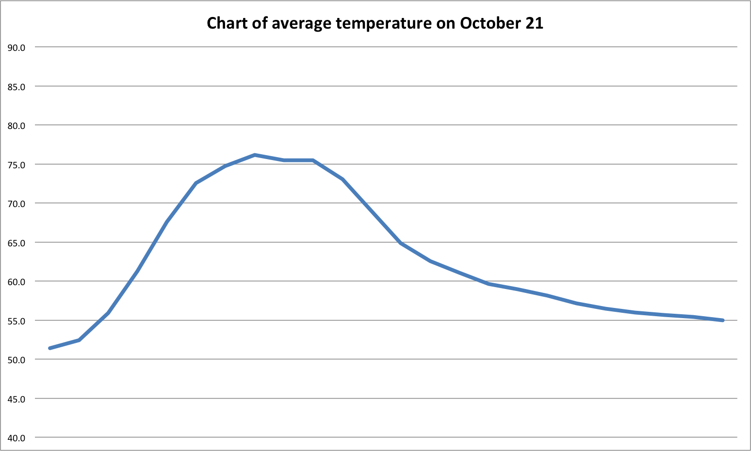
…and this is what October 21 looks like averaged during 12 years…which is similar in look to the annual graph
Similar to our average day, as the sun stays up longer during the day as part of the seasons, particularly summer, it heats the earth more during the summer, and during the winter as the sun goes lower in the sky for shorter periods, the temp lowers. The longer the sun is not involved in heating the surface of the earth, our temperature lowers and vice versa.
Here’s an exercise in tautology. The sun comes up, it heats the earth. It goes down and the earth cools most days. During our seasons, the sun stays up longer during the summer and it warms the earth significantly. And of course as winter approaches in our season, the earth’s surface is not exposed to the sun as long so the earth doesn’t get as warm. It’s really pretty simple.
There are other influencing factors like cloud cover, surface type, albedo, altitude, humidity, air mass type, density, etc., that directly influence our temperature and what we feel, hot or cold or ‘just right.’ All of these variables can affect temperature, but it appears the predominant mechanism of heating the surface of the earth daily AND annually, is the sun. We observe and verify this when the sun goes down in our evening, the temperature almost always lowers.
The Heliocentric Climate Season Theory
If anything, if there is denial by anyone, it appears it is a denial of the sun’s influence on our earth. We know, we see, we observe the cycles daily and annually, but for some reason these cycles are seemingly ignored by many, especially the influence of the heat of the sun. And ultimately my theory is this, if we have observable patterns in our day and year, WHY WOULDN’T WE HAVE THIS PATTERN WITH OUR CLIMATE?
That is, we normally observe a high and low temps during most days all the time with morning lows and afternoon high temps, AND we observe a high and low temp seasonally and both are directly related to solar influence. So, why wouldn’t we have a longer term pattern, or a ‘climate season’ that works similar to our day and our year.
The question of the theory, does the climate of the earth, have a winter, spring, summer and fall that spans across decades or centuries? After all, we can see a winter, spring, summer and fall in our day and year, why wouldn’t we have one for our climate as well?
And if a ‘climate season’ does exist, what ‘climate season’ is our earth in currently? Are we entering the tail end of our ‘summer’ climate season going into fall, in which case global temperatures may lower as they do on average in our year, or day?
My numbers and the Alabama State Office of Climatology data…
The information provided is directly from my weather station, For more information on what I use to collect temps please see this link, wx stations. There were instances during certain years that the weather station was offline for a period due to moving or service. The same is/was true for data collected by the state. During these times, I used data from the Birmingham or Shelby County airports, or an average or the two found at this website from the National Weather Service climate office in Huntsville, AL.
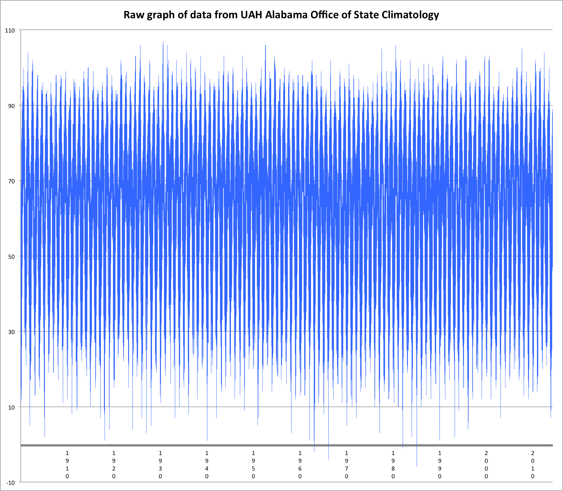
plot of all data points gathered by National Weather Service Offices in Birmingham since 1900
For a while, I wrestled with how to present this. I had a broad vision in my head of the general idea. But there is a great deal of data as you can see above. If you think about a single day our temperature can change in seconds or minutes or stay relatively static throughout an entire day of 24 hours. Then take that 24 hours in one day, times 365 days, times ~12 years or 113 years, and you get the idea, it’s a lot of numbers. But at the same time, this is a relatively small snippet of our climate and time.
While it is a basic graph, it represents hundreds if not thousands of numbers. The number shown are a graph of average temperature in Fahrenheit for ~12 years, I had to get this to a manageable bite sized chunk for digestion. I’ll be happy to provide the data if necessary.
One year = One ‘climate year’ day
Something else to consider in all of this, time of day is relative, specifically sunrise and sunset times. It was a challenge to work this out. Meaning, I am trying to look at a single day as I would look at a year. December would be just before sunrise; January would be near sunrise, February – May would be mid-morning; June – September would equate to midday thru sunset and October – December would be late evening through overnight. This was a challenge to get my head around.
Then add to this sunrise would be at different times throughout a year. But with this whole idea, I had to kind of ‘not be too concerned with the time of day’ as much as the time of year and how much incoming solar radiation was occurring. And no, I did not get into the details of how many kwH or solar discharge is/was occurring.
It is also noted that I understand Hoover is not at the equator or the Tropic of Cancer or Capricorn. I get it. Geography and other factors matter. Again, this is a simple study in how the sun affects temperature and a study to help prove my theory that our earth has ‘climate seasons’ that may affect our longer term temperatures, higher or lower.
The graphs
So I started simple and picked the Winter Solstice, Dec 21-22 of the dataset I had recorded and continue to record. I picked this day because it is about the day the sun is lowest in the sky and is near the shortest period of sun light hitting the earth in the northern hemisphere. It is our annual ‘darkest day’ and near the bottom of the scale for the coolest time of our year.

December = just before sunrise
This worked pretty well and confirmed what I had envisioned. At or near the SUNRISE in our day, the temperature rises, and at or near SUNSET of the same day the temp lowers. This is a visualization of what our average temperature looks like on December 21-22 in Hoover, AL for the past 12 Decembers.
Then January was next, although I think I did the solstices and equinoxes before January just to kind of prove this out. I also wanted to mention the reason for picking the 21-22 or or 22-23 of each month. The main reason is/was the solstices and equinoxes occur about this time each month.
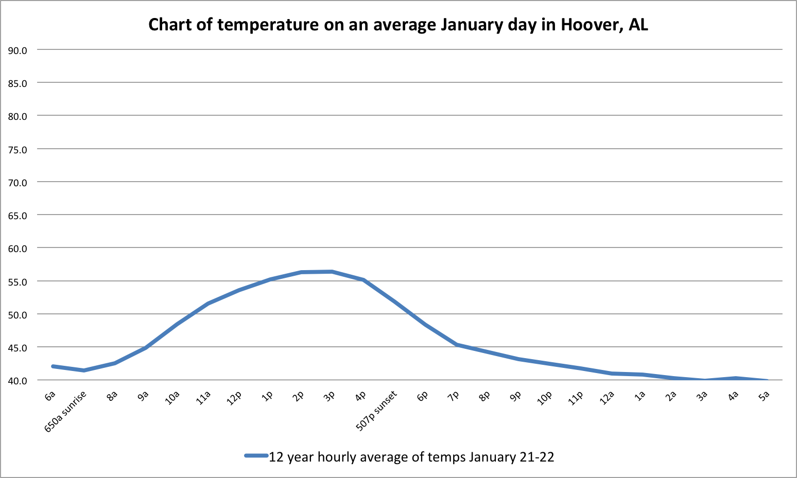
January = sunrise
The first thing I noticed was the temperature for January was lower than December. BUT, it is a similar kind of line. Sure enough, sun rises and so does the temperature and conversely, the sun lowers in the sky and the temp lowers.
As for the overall average temp being lower, I believe this has everything to do with a longer period of the sun being at a lower angle for an extended period, minimizing insolation, or incoming solar radiation and ultimately minimizing temperatures. But we are about to see a rise in temperatures as we head into February.
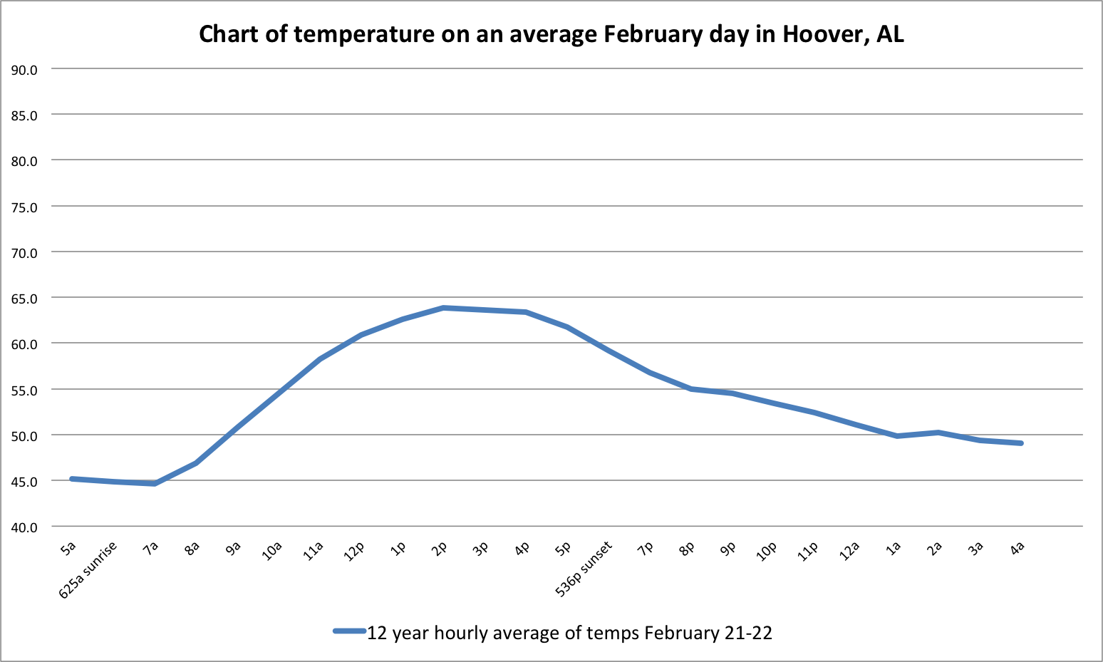
February = just after sunrise
The first thing we see in February is a similar line to the other days. But we see an overall increase in our starting temperature for our February day.
Next month is March and we get close to one of the two days of equal day or nights. That is the sun is at or near directly overhead and there is close to an equal amount of day and night. And we’ll see our graphic is warmer too…
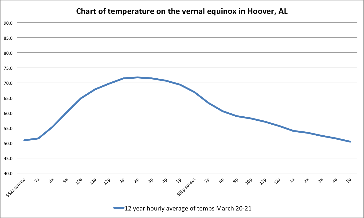
March = mid morning of a day
We notice an increase in overall average temperature and we will through July. But we all know August and early September can be as hot if not hotter than June and July. You’ll also notice in the March graph, the sunrise and sunset times are almost the same.
Here is April and even warmer…the graph line is very similar to previous months…
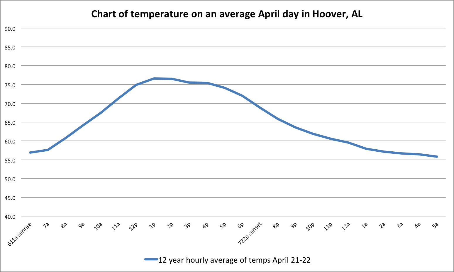
April = later morning
I think it was around here that I had to start changing my Fahrenheit scale on the left hand side as we headed into May…
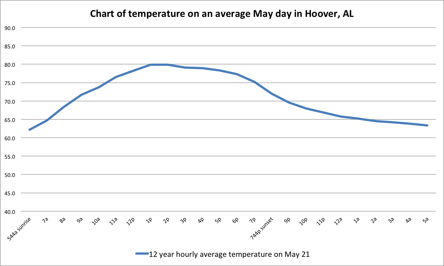
May = nearing lunch time in our ‘climate year’
And one thing I noticed now was our line was starting to flatten a bit. But we still have that rise/fall pattern based on insolation. It was all coming together nicely.
June is the time for the summer solstice. This means the sun reaches it’s most northern excursion point, or highest angle and longest period in our year above the our heads. This directly relates to much higher temps for most of us in the northern hemisphere.
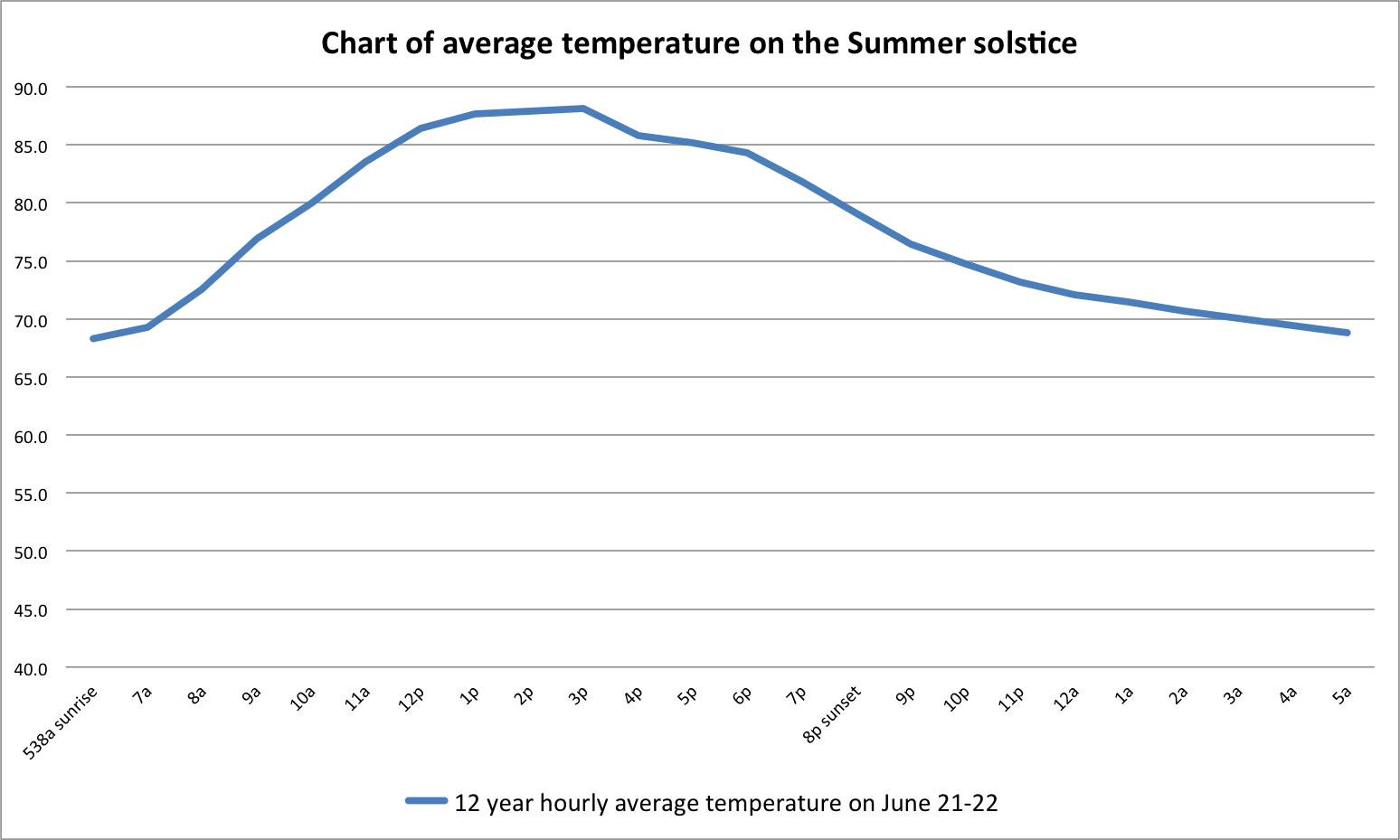
June = equals 12 – 1p or lunchtime!
Then comes July and we are getting even warmer even though our days are getting shorter and shorter. Again, the effects of the lack of sun during December into January, work just the opposite now. June – early September are our warmest even as the days get shorter and shorter until we reach the winter solstice in December.
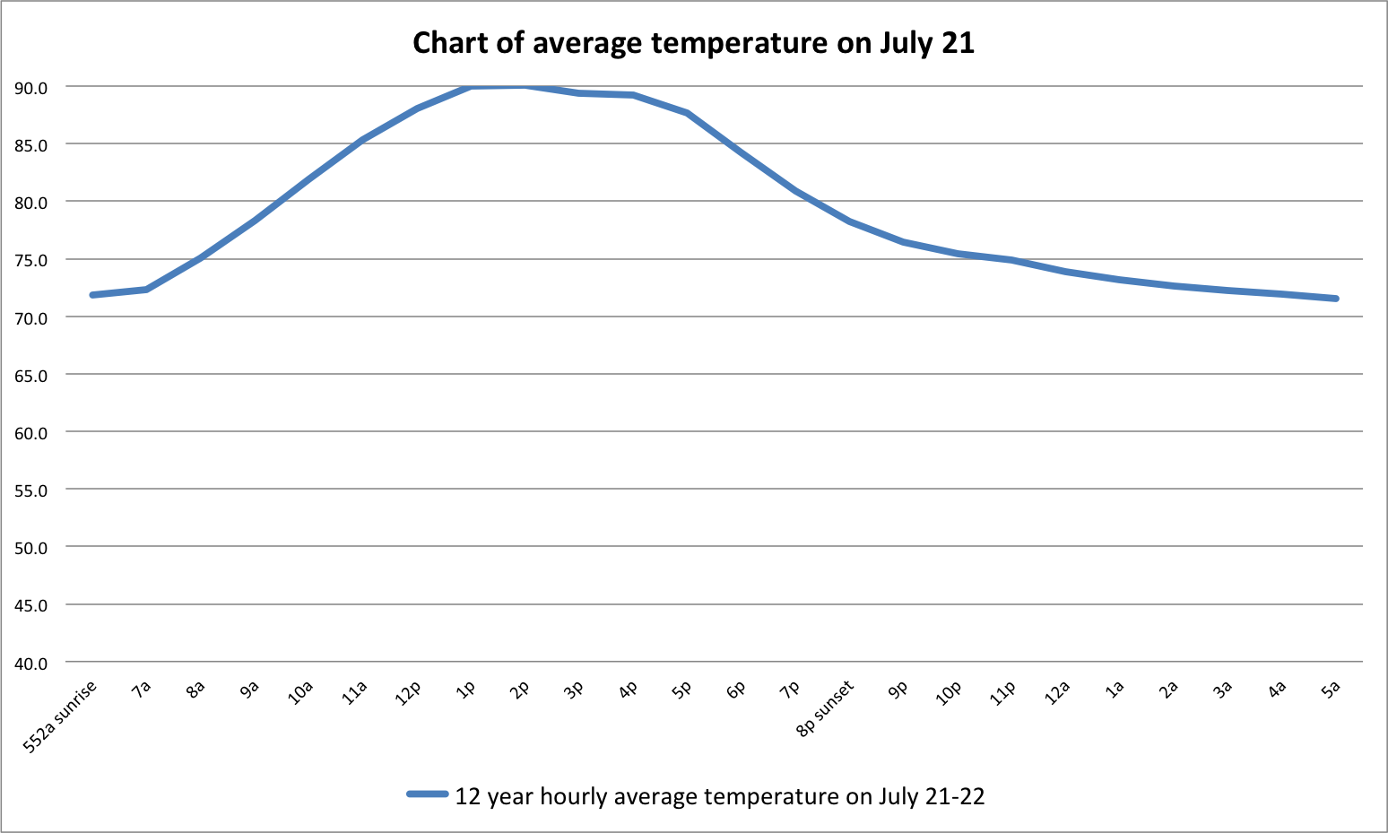
July = start of mid afternoon and hottest portion of year
It is also noteworthy that the solstice happens around the 20-23 of June. That is almost July. Which is why I had made the mention of time being relative earlier in this document. As it relates to our ‘climate season,’ we are not so much concerned with the actual time of day as much as the sun coming up or going down. This was difficult to ‘not’ think about as so much of our day revolves around time.
And we stay warm in August but as you can see in our graph, we start our climb back down the ladder as our days get shorter. But if you live in Alabama, it’s still pretty warm.
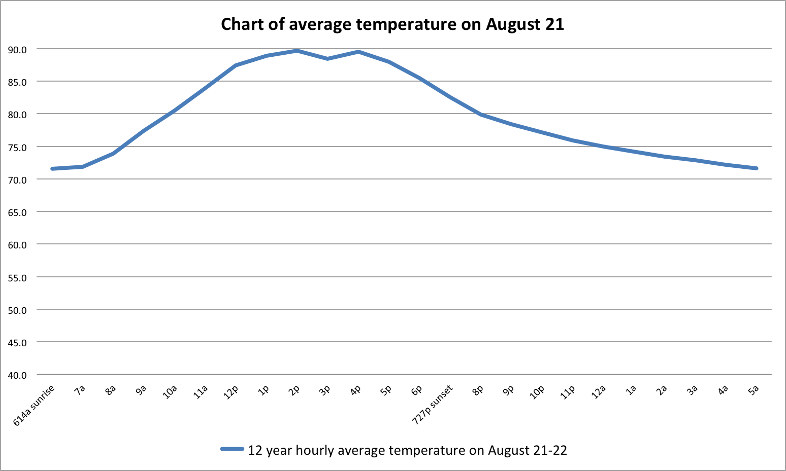
August = late afternoon and closer to ‘sunset’
One of the most obvious points of this chart is the small dip in average temperature around 3:30p during a 12 year period. And about the only thing I can attribute this to is many times in Alabama, in August, we have afternoon thundershowers around this time. I double-checked and re-checked the data and graph. It came out the same every time. It is one of the few real noticeable differences in all of the semi-sinusoidal lines.
It’s also interesting to note as we enter September, we reach our peak of hurricane season. And if you don’t know this, hurricanes are greatly influenced, if not primarily ‘powered’ by warm sea-surface temperatures. The seas are warmed by THE SUN. We start hitting our peak temperature in late June at the peak of the suns incoming solar radiation during our year. And it is no coincidence that the sun affects sea-surface temperatures as it has been heating the sea now for a solid 2 months…a great deal of energy is stored in the oceans.
And in September we really start to see our decline in temps. We also see a similar but warmer line to March. It’s obviously warmer in September in the northern hemisphere but overall the average temperature is coming down.
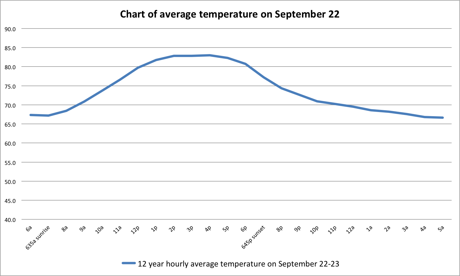
September = almost sunset but still warm
And October the decline continues and you may notice our average low starting temperature for our day is lower too.
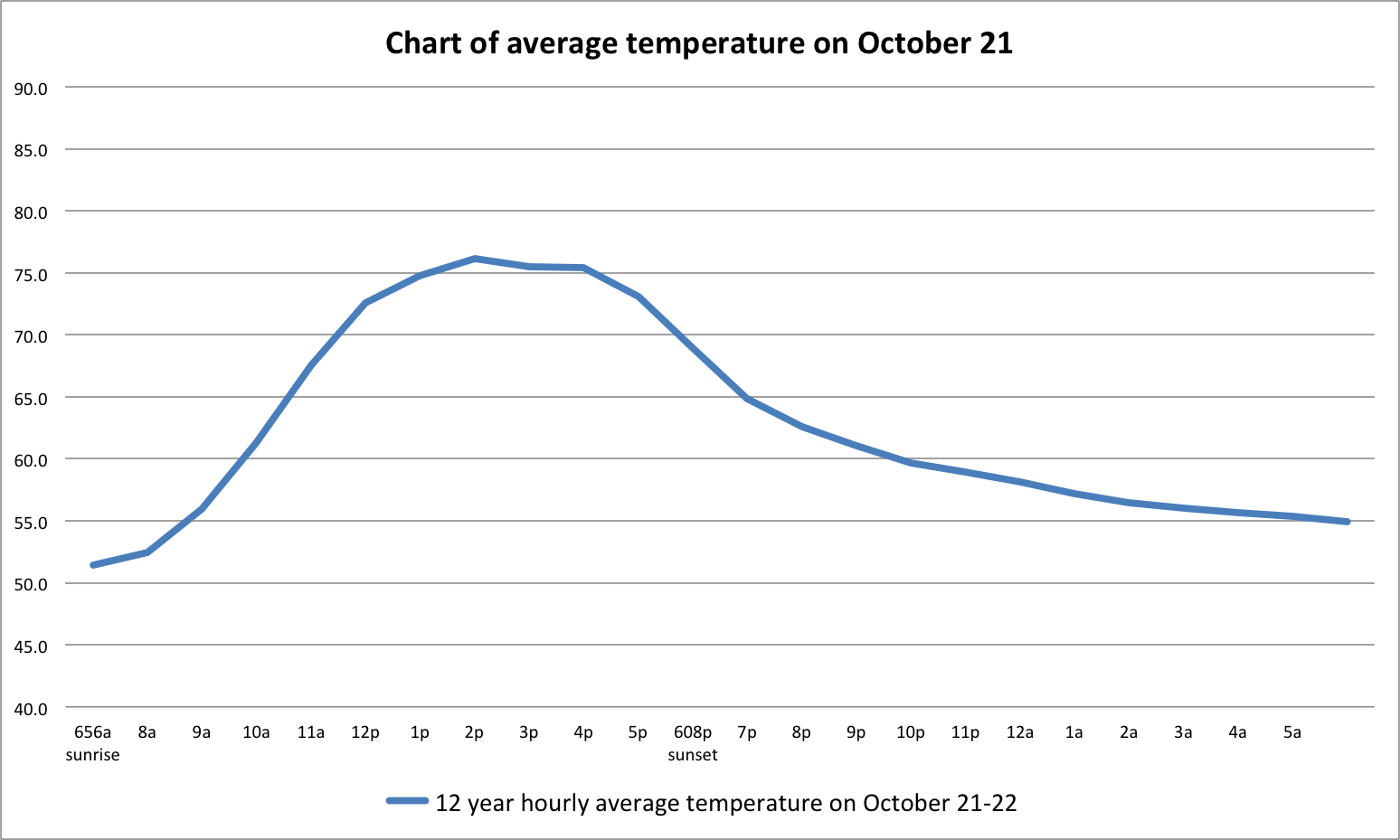
October = night time but before midnight
And as November comes around, we see that average low starting temp for the day drop off pretty dramatically.
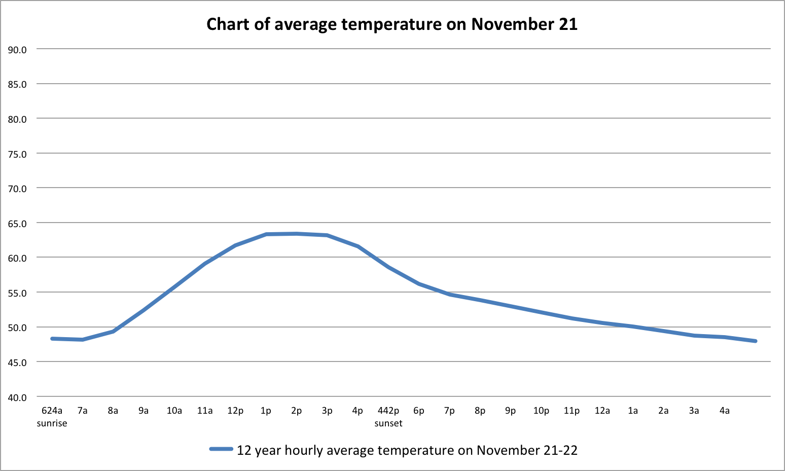
November = after midnight and we’re getting colder
And we’re back at December again…
December = just before sunrise
What have we observed?
- During an average day, when the sun is below the horizon our temp lowers.
- As the sun comes up, the temperatures also rise.
- As the days get longer in the year, the sun heats the earth longer creating warmer temperatures or AKA summer in the northern hemisphere.
- As the sun goes down, the earth is not heated as much which relates to lower temperatures at our location.
Putting it all together now…
The graph you are about to see starts in February, or ‘sunrise’ as the temperature in our year begins to increase and ends in January our lowest average temp. I wanted to start just after the ‘coldest’ portion of the day and end on the decline back in December, almost making a loop.
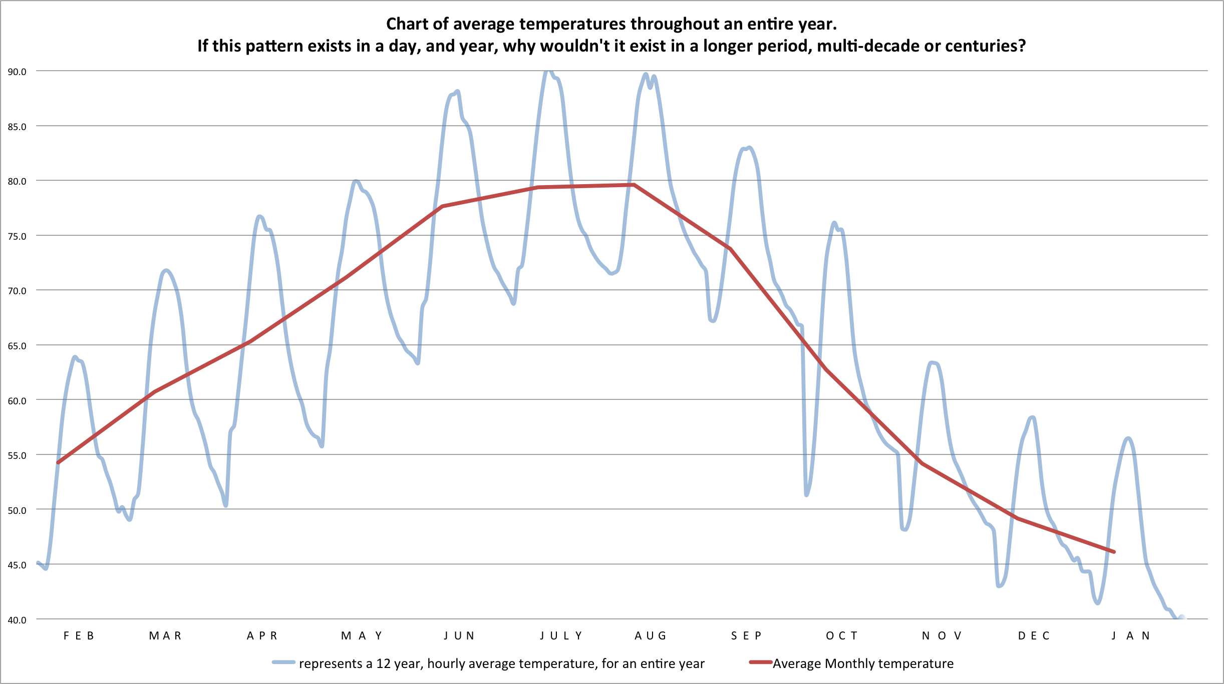
What do we see in our pattern?
- The first distinction for me is the maroon line which looks very similar to our daily line for average temperatures during a 12 year period.
- But this maroon line represents all of the months combined and an average temperature which just so happens to look like the purply line individually.
- The red, purply line is the same data shown in the earlier graphs, except ‘connected’ in one chart to exhibit a daily high-low temps.
Now let’s really TRY to connect the climate dots
In our helio-centered climate season, we are making what we consider a year to us, into a ‘climate’ day. That is one human year = one climate day, because we have seen in our day and year that there is the same general pattern centered around the sun and the warmth it provides.
Just like each of our normal days have a high and low temperature, then in our ‘climate day,’ each year should have a high and low temperature for the year. And if we can establish a high and low for the year, (like we do in our ‘human’ day) we may end up with a graph similar to what our graphs look like previously in this article.
If you are still with me here, (God bless you!) I’ve created another graph. In this graph, I’ve taken my data, picked the high and low for each ‘climate day,’ or what we consider a year to us and charted it.
Almost all of this data originates from the Alabama State Office of Climatology. I’m sure there are better locations but I couldn’t find a more complete set, quicker to get this done. And the data represented goes back about ~113 years, or to 1900.
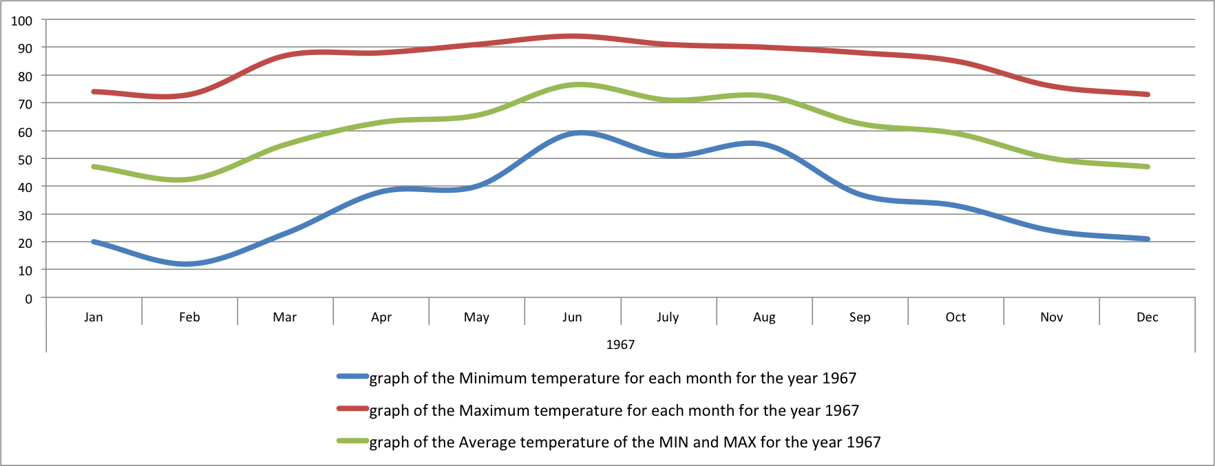

representations of the some of the detail of high and low temps in BHM in 1904 and 1967.
In the two graphs above, one major difference in what we see is the detail is not as great, but the concept is the same. Throughout a year, as the sun is higher in the sky for longer periods of time, the overall temperature rises. I did not have access to hourly high/low temps going back to 1900. I think on the AOSC website, the hourly detail goes back to 2002…about the same time I started recording temps too. But those folks are professionals…it may not be publicly available.
Really bringing it home…
IF we see this sinusoidal type pattern consistently in days and years, my thoughts were maybe we can see a portion of a similar sinusoidal pattern during a 113 period. Again, the idea is we treat one year like we normally look at a day and perhaps we can see a glimpse of a portion of our climate season.
excel chart of temps from 1900 to 2013ish with an excel trendline added…
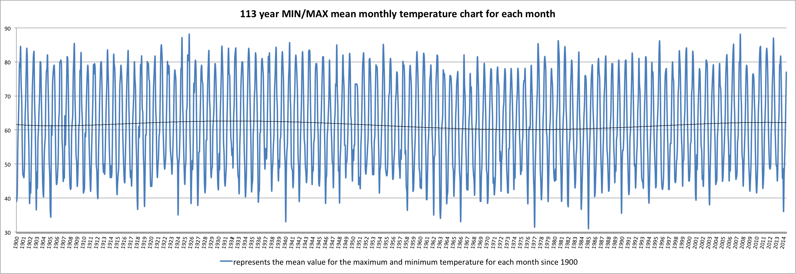
So here we are. How I created this basically was taking the minimum and maximum temperatures for each month, within each year, and creating an average temperature for the month going back to 1900 to 2014. I think I even threw in data from 2014 too.
The idea is this, if we zoom out and get a larger picture of temperatures, an average/mean would work best for a month…not much different than looking at a clock in terms of hours, or days or months, or years, or decades, or centuries. We can set our zoom and maybe get a look at something like we would see in a day and year, but on a 100 year scale.
And adding the polynomial trendline, it looks like an oscillation. In 1900, it looks like it starts about where we are in our temperature swing now in 2014, maybe a little above 60f average. But look what happens in the 50s-70’s…the overall BHM average temperatures drop to about 60f or so. This of course was during the period when scientists were saying the ‘science was settled’ and we were on the verge of the next ICE AGE!
And more recently it has trended upwards. THERE APPEARS TO BE AN OSCILLATION IN OUR LONG TERM TEMPERATURES, UP AND DOWN, ALMOST LIKE THERE IS A PATTERN TO IT, LIKE OUR DAYS AND YEARS.
A lot of numbers…

lots and lots of numbers…
At this point, I am swimming in numbers and trying to stay focused on the task at hand. Does some kind of pattern exist on a long term, climate scale and establish a climate season? I did take a bunch of different stabs at this, but I wanted to take a little time and point out this chart above. When showing this to my wife, she pointed out that ‘dip’ in 1985. I remember this year and remember thinking how cold it was. The high temp was 22 and the BHM low was 8. I think it was around this time we had temps below zero too!
Anomalies happen. Some days are cooler and/or warmer than average, just like some years are cooler or warmer than average. There are variables beyond our human control that affect temperature and systems.
Continuing, I had an epiphany about zooming and time, which is why I mentioned this before. Like a microscope we can zoom in an out to varying levels of detail, micro to macro. But I took the time to average out all of the temperatures on the graph above to point out that you can visually see the changes, from year to year (climate day to climate day) in this chart here…
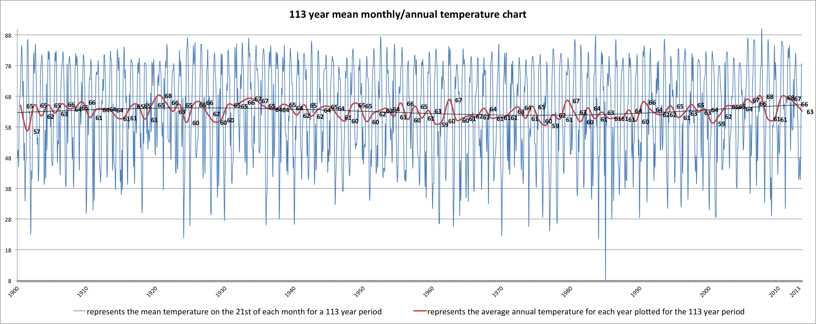
the 21st of each month from 1900 to 2013ish…
It’s not the nice sinusoidal type wave I thought would be there but neither does a day look all smooth and neat when we look at the detail. So I backed out even more…let me look at this from a broader perspective, like decades.
So more number crunching later, and Excel graphs and charts and making sure the data is accurate and lining up right and poof…
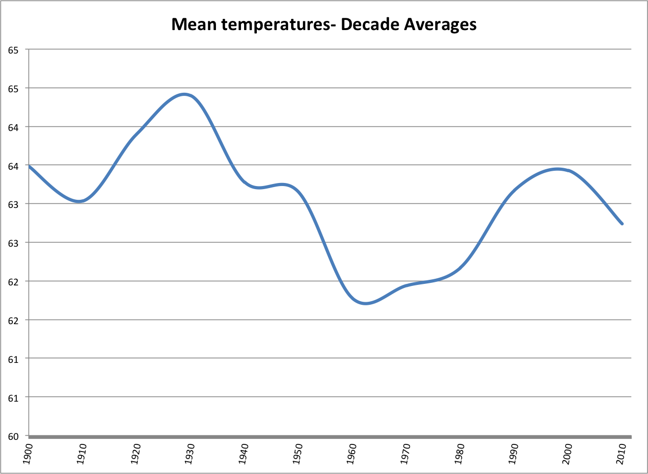
looking a bit more like our daily temp swings…
Well it doesn’t look exactly like our daily or annual temperature swings but we must remember this is a snapshot in time…and I don’t have access to data going back +100s of years. Our climate season will be difficult to see as we are only seeing a snippet in time. But, the ‘cool’ thing is, the data lines up pretty well with what was recorded about the 20-30’s being warmer than normal and the 50-70’s being cooler than normal.
The above graph represents all of the temperatures recorded from 1900 to roughly 2013, averaged into a year high low, and each years high and low goes into an equation for the decade to establish a ‘decade’ temperature.
And what is to say that we do not return to a average of 53 or 54.25 or 52.95 or 57.9 in the coming years? I do not know the answer to that. But based on what I am seeing, and based on what all of us have experienced, and seen in our historical data, I am convinced we will see a return to a cooler period, rather than increasing climate temps.
And who knows, maybe on a long enough timeline, we may be here for another ice age? One thought I have had is ‘perhaps’ we are entering the September of our ‘Climate Season.’ Or maybe we are entering the ‘summer’ of our climate season. This is the tricky part and something I could not necessarily put my brain around in this article.
I guess we will have to wait and see. In the meantime, stop denying the sun. As we have seen repeatedly in the data, no other force affects our temperature more than the sun.
A couple of final notes…
- I am grateful to God for the opportunity and ability to do this research even if someone else has already done it. It’s been fun to analyze and figure out. I sufficiently got my geek on. And who knows? Maybe it’s right after all.
- I am grateful to my nephew Tandy Nicholson for looking over my shoulder and helping proof it.
- I’m also grateful for my other nephew Chris Arias for being a sounding board for Excel questions. Excel is our friend.
- Cicily Gray was the inspiration for the name “Climate Seasons.” I added the Heliocentric portion to it. I was having a bear of time putting a name on it and in about 30 seconds, she just popped it out.
- Another thing on my list of things to do is to find and perform similar analysis in other locations. My guess is I will find similar findings in other locations. Yes, I understand this is one location out of thousands of locations with temperatures recorded. I also understand the variables associated with location, geography, etc.
- The data gathered, except for what I have recorded can be found on the web at http://nsstc.uah.edu/alclimate/climate/daily_climate.php . In places where data was missing from either mine or theirs, I used some other website to determine the high/low values for the day. If you would like, you can download the data yourself and spend hours analyzing and overanalyzing this too.
- One thing I noted in pouring over all of this info, it seems that when things are automated, that’s when the data is not recorded. I only found 3 missing days in the first 100 or so years. I am thankful 113+ years later, for other folks with similar interests to have done such an amazing and diligent job tending to their jobs, even if it was simply recording the high/low temps in 1900 and later.
- As always, if you would like to comment, you can do so here, and I will get to it when I can. Or go to Facebook and leave a comment here. I check that more often than here. I would greatly appreciate any feedback and analysis too. If you see an error or missed something or want to see another chart, etc., let me know.
#weatherwalrus