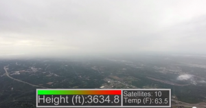
A friend of mine posted this on FB recently. I know very little about ‘drones.’ But this is pretty awesome. It’s a video of his new quadcopter with telemetry including altitude and temperature on screen.
I also only know a little about ‘soundings’ performed by the NWS daily. As I understand, a balloon is sent up from the local weather station, twice a day. This balloon has a package of sensors attached to it, recording a ‘slice’ of the atmosphere including temp, wind direction, and other information. Basically it’s a tool for atmosphere analysis. More info about upper are sounding can be found here or here.
And basically, this is what’s happening here, except this is quad copter doing the ‘measuring.’ As we’re watching Michael’s video, we notice as the copter elevates, the temperature drops. And one of the things I learned from meteorology school about 14 years ago, as well as experienced personally when flying (no I’m not a pilot), on average per 1000ft in elevation, the temp drops about 5 degrees, but is not always the case.
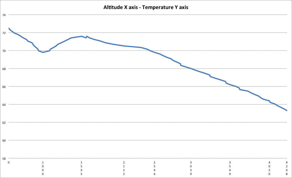
So knowing a little about the weather and seeing the telemetry data on screen, I thought it would be neat to graph this.
Warning! I’m doing math and graphs
So we start at 72ish at the surface and as we rise, while the temp moderates a bit, around 1000′, by the time we reach ~4000′, the temp is about 10 degrees cooler.
In this instance, our average rate of the decrease in temp is about ~2.5 degrees per 1000′. There are much smarter folks out there that can explain much greater detail about ‘warm noses’ and varying temperatures with height and why all of this happens. But I just had to share.
And thanks to Michael for providing the info. If you would like to comment on this, visit https://www.facebook.com/weatherwalrus

