I noticed the al.com this morning about our record low temps in BHM for July 5. If you recall, I posted a few months ago about ‘temp dips‘ and how we should be looking for this to occur periodically throughout the summer. SO FAR WE ARE RIGHT ON TRACK.
Our July 5th low this morning at work was 63, and at home was 61…very nice. And for those visiting Texas now, it sure is nice here in Alabama, for the next 10 minutes.
But I got to doing some over analysis, and what started as doing a few weeks worth of analysis to determining what the temperatures have done on average for the past 113-ish years. I’ve done the analysis for my theory on Heliocentric Climate Seasons, and had all of this data sitting there, why not see what our ‘low temperatures’ in BHM look like for the past century plus.
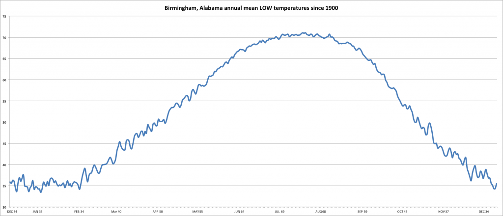
And like we see in the HCS analysis, we get this real pretty sinusoidal wave, based on the influence of the sun. As elementary as it sounds, the sun goes up and the temperatures rise in our day and year. As the sun goes down, our temperatures lower in our day and year.
When looking at this, much of the detail is lost because this is a very large data set. Remember this shows low temps in Fahrenheit for every day since from 1900 to 2013. Doing some quick math, 365 x 113 = 41,245 total. Then we have to average these for each day of the year and it was A LOT of manipulation and massaging.
One thing I noticed with the low temps, as the year progresses and we get into the ‘hotter’ months, the average low temps are not making such a drastic swing. That is, as it warms, the average low temp doesn’t fluctuate as much as it does during the cooler months. But, our ‘zoom’ is way out.
And if you are wondering why I started in late-December, that’s when the winter solstice occurs. It is the lowest point the sun makes in our trip around the sun. It should be near the lowest temp of the year, and sure enough it is.
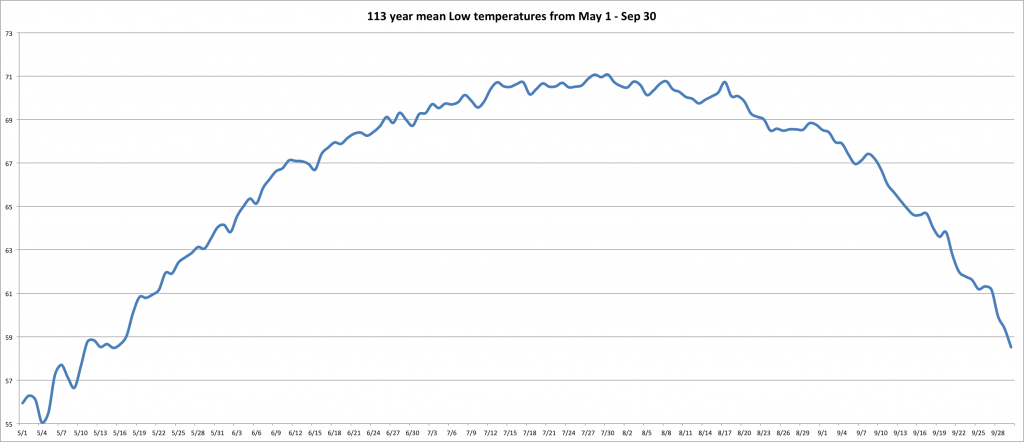
My next graph, I wanted to ‘zoom in’ and show more detail of our warmest months. Perhaps this will give us a better idea of any patterns in BHM as it relates to temperature. Let’s take a look…
Frankly, it looks like a jagged line. But remember this is an average low temperature view for BHM for the past 113 years, FOR EACH DAY of the year. We can really see there are some drops in the temps, but the dates don’t necessarily line up. The idea is though that we get natural weather influences that make our temps drop noticeably on average about every year. And I’ll bet as we study this for a longer period of time, there will be a longer term pattern too.
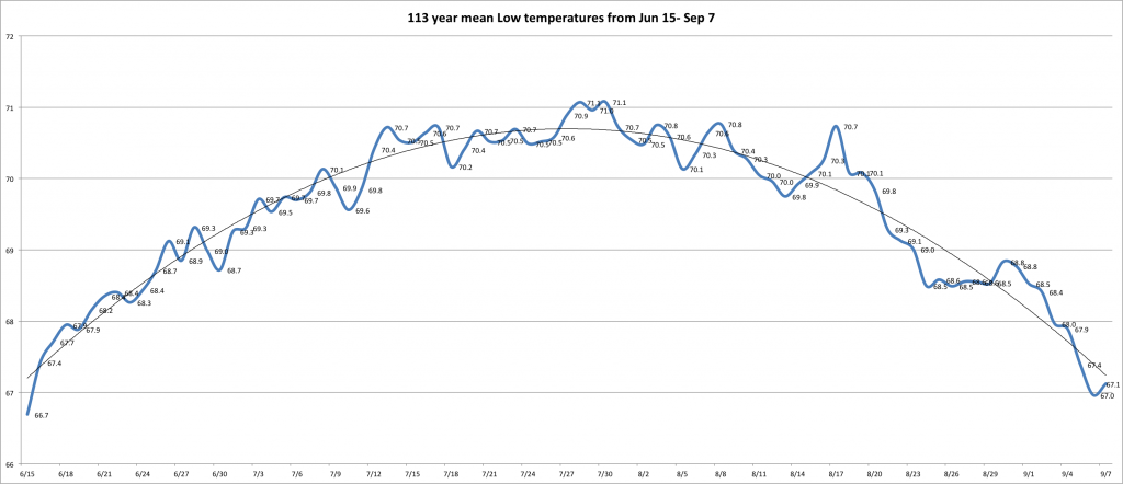
Then I narrowed the zoom a little more to June 15 – Sept 7. Using the bigger chart, you can see our average daily temp rises about June 15, above 67 and lowers below 67 on or about Sept. 7. That is show in this chart…
Looking at this during our warmer months in Birmingham, Alabama, we can see there are various average drops in temperature. These may come a few days earlier or later, but they happen. And with the trend line in place you can get an idea of how the trend of our temp will behave for the next coming months…which is no real surprise because we are past the summer solstice and the days are already getting shorter.
But perhaps worse yet, as I write this on July 5, I have had the realization again that we haven’t hit the real peak of our summer heating and will not for a few more weeks…which is very unfortunate. I DO NOT LIKE SUMMER. But that has nothing to do with this analysis.
STAY COOL and let’s hope we have another cool summer like we did in 2013.
If you would like to comment, post it either here or on https://www.facebook.com/weatherwalrus


