Most of you who know me, know of my great disdain of summer. I think it’s one of those things that must be endured for years for one to truly develop a contempt for sweating every time you go outside, or if you are visually impaired and wear glasses, having your glasses fog up, going from indoors to outdoors.
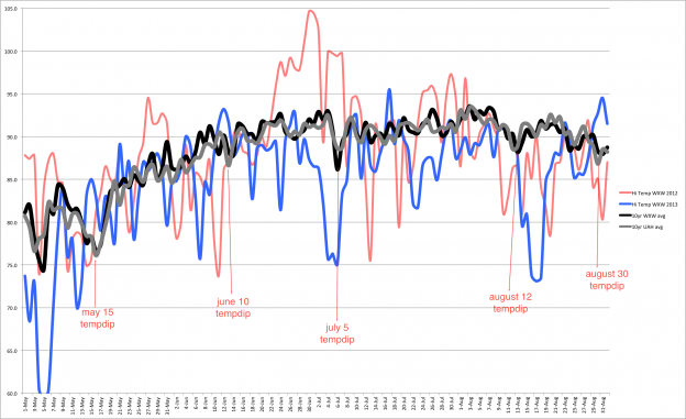
As I write this, May 2015 is about to begin. When speaking to a co-worker about the pending summer arrival, I wondered at what point do we in central Alabama begin to cool off again. And since I’ve done some research about temperature dips in summer in Alabama, I thought I would venture down the road of figuring out what day of the year is kind of an average, when central Alabama reaches it’s hottest average day. When could we expect it to start cooling again?
Knowing this day would give me something to look forward to since I would know that about this day, we would start the decline in temperatures and HUMIDITY towards a more comfortable and reasonable environment. The bottomline is we will have to endure this unpleasantness each summer.
How did I get there from here?
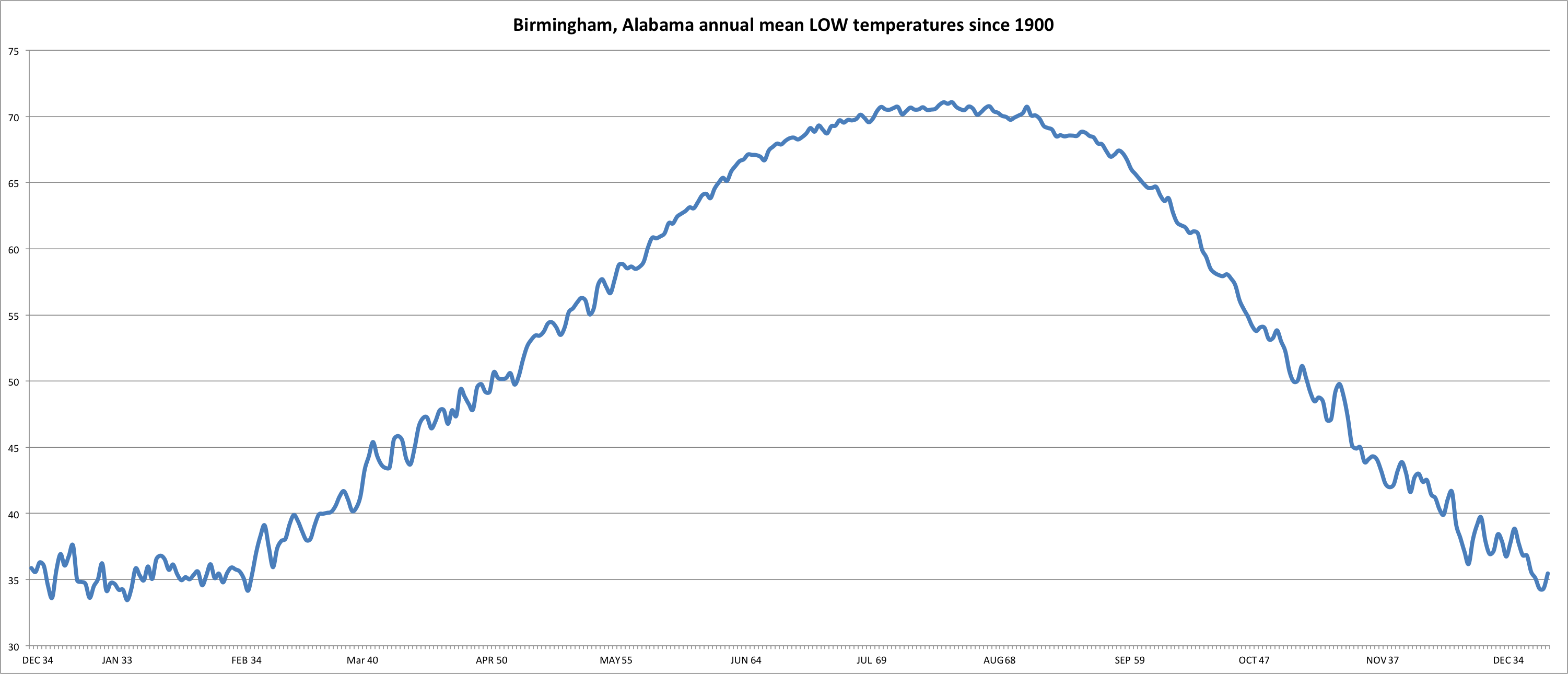
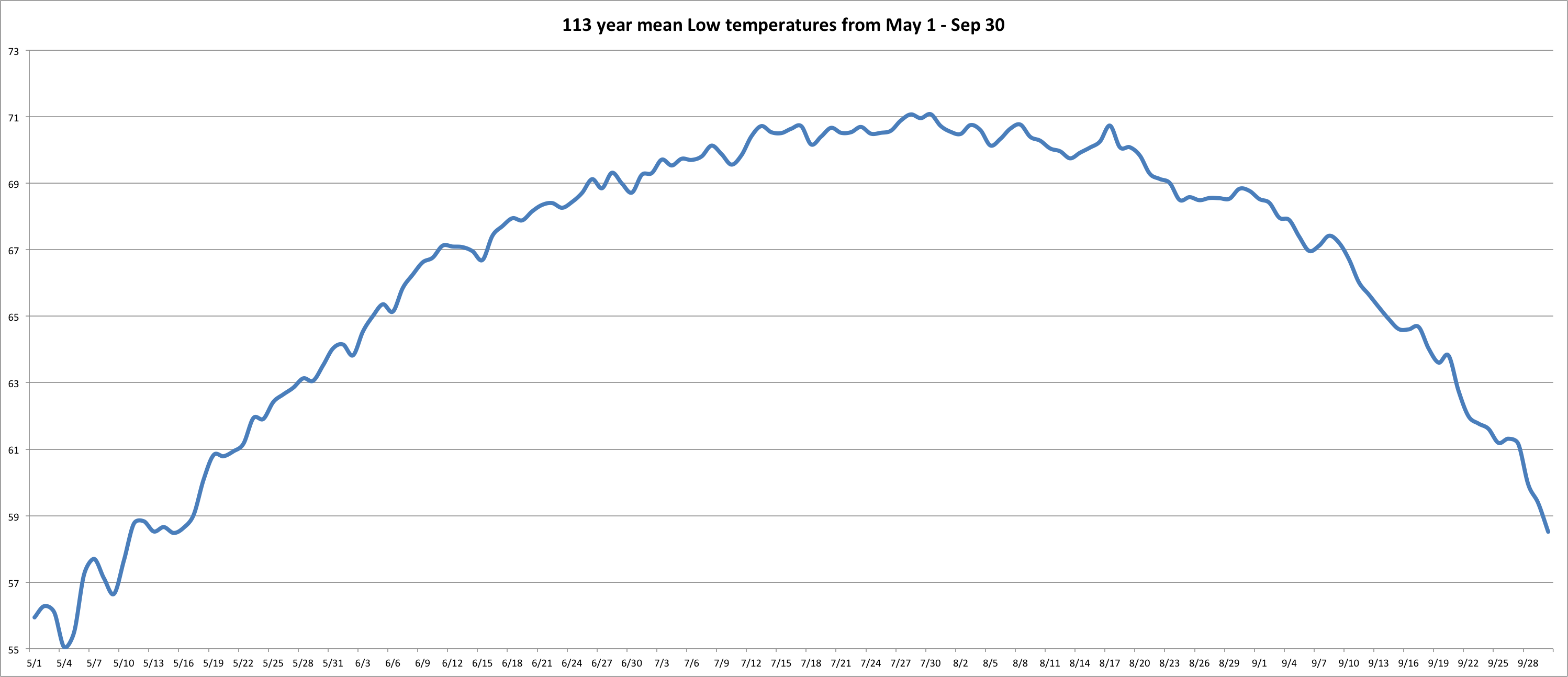
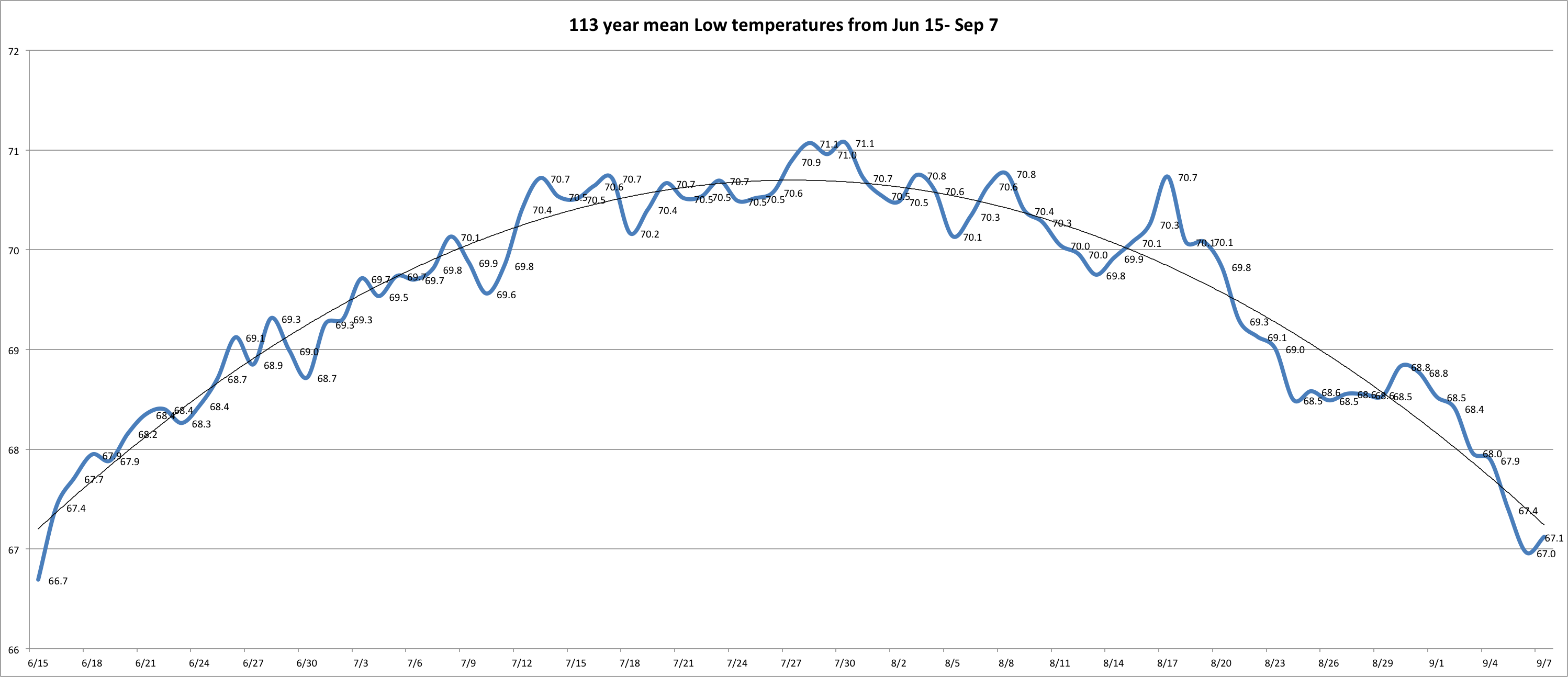
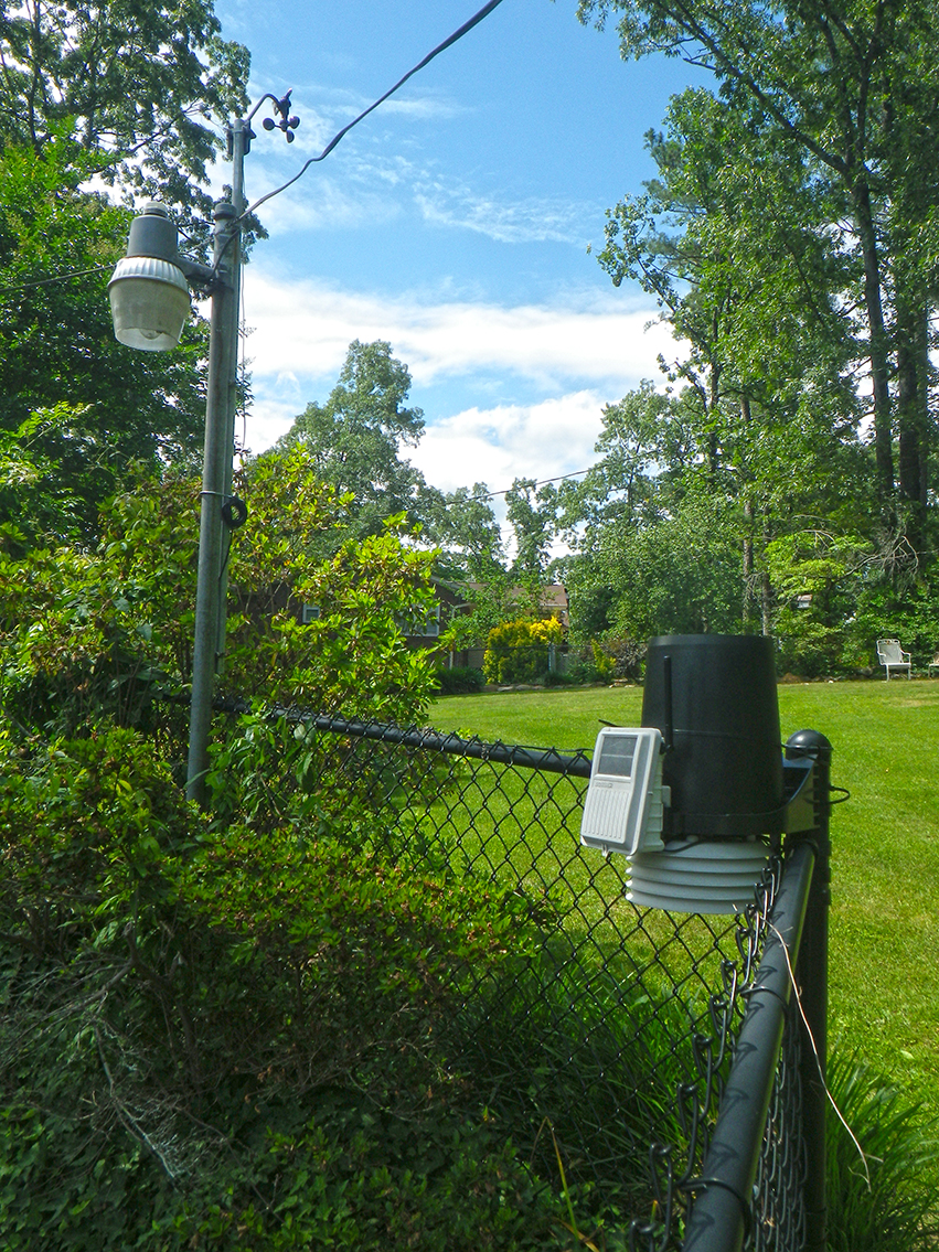
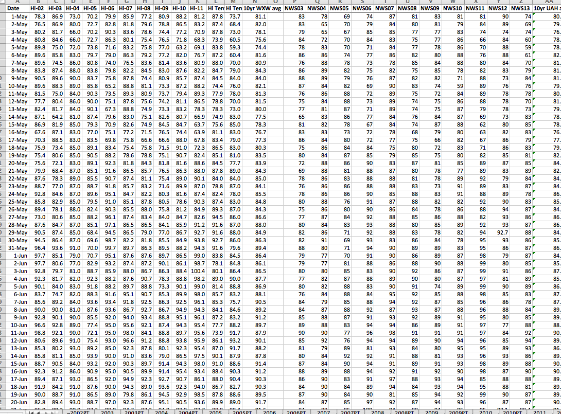
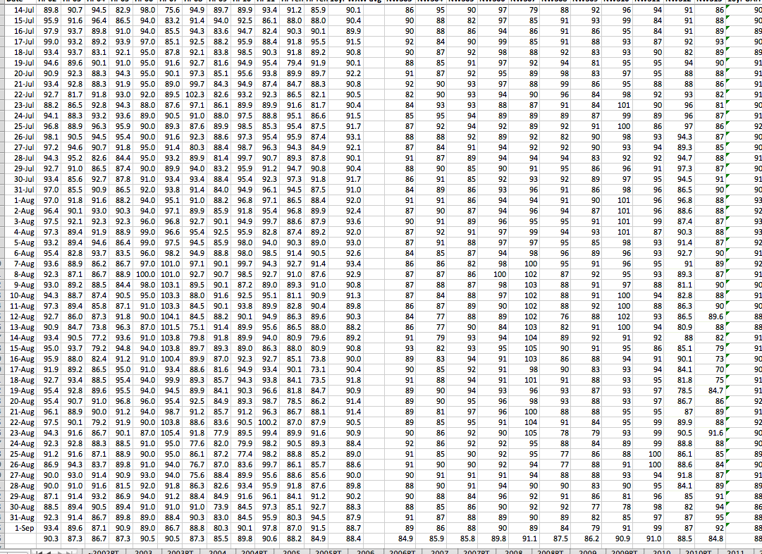
Basically, I had the information from my analysis about various cooler periods during our normally hot summers. During this analysis, I had collected an 11 year mean average temperature on my weather station at home and gathered the same 11 year mean average from the National Weather Service.
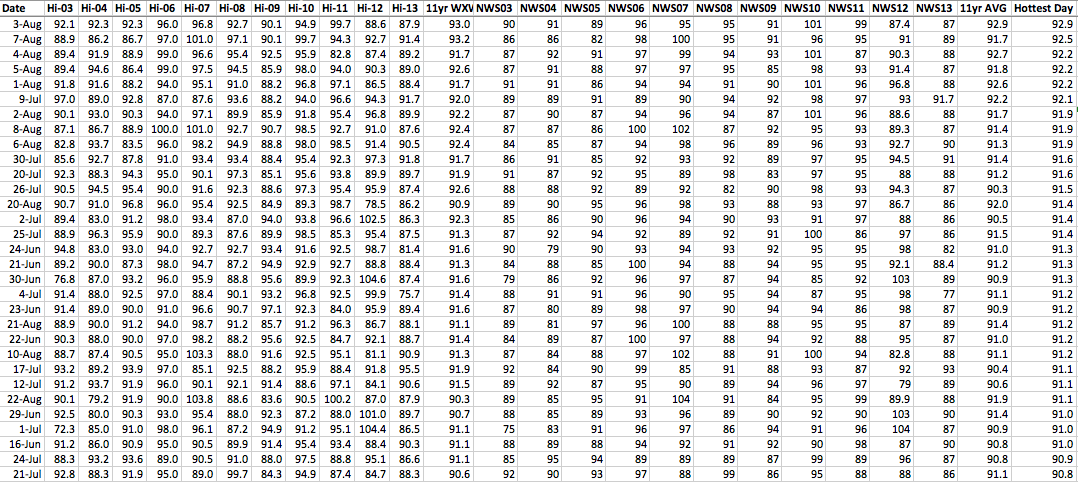
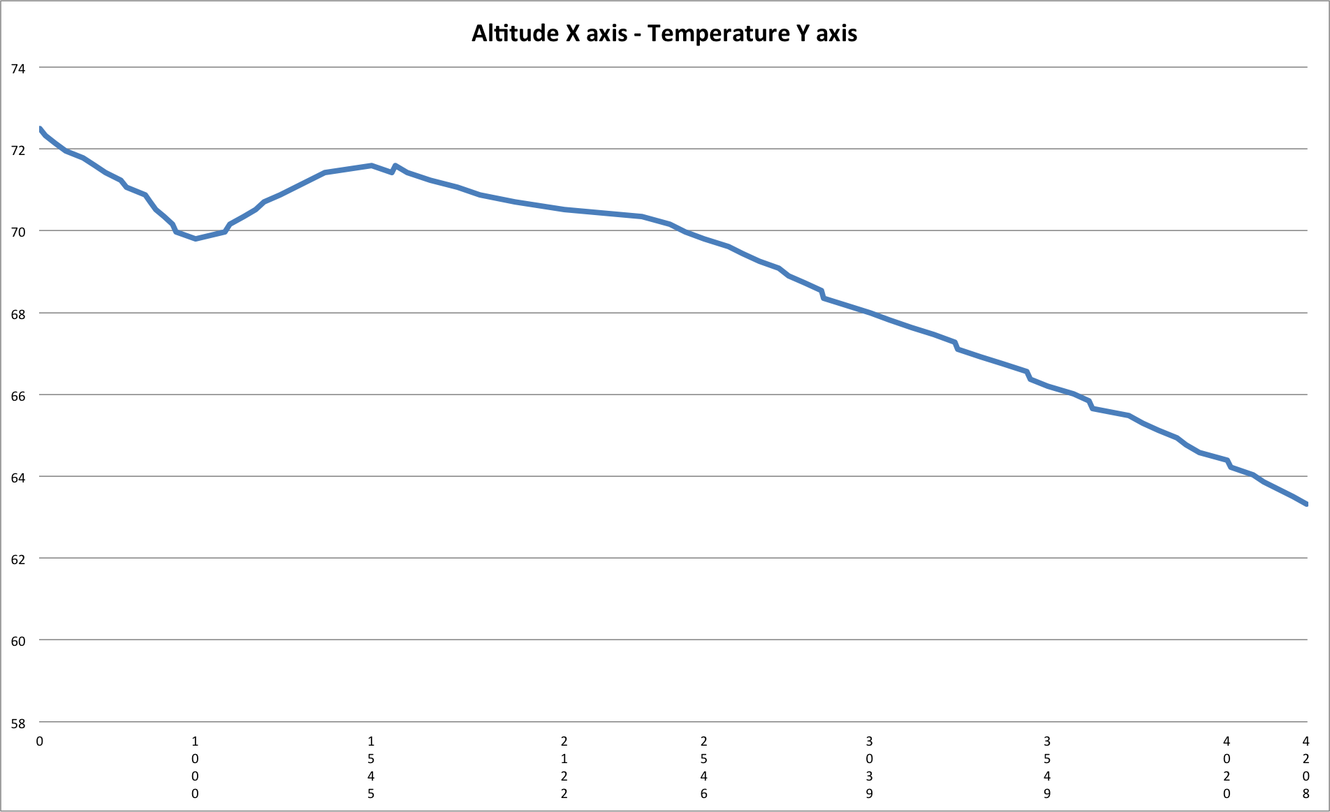
Top 31 warmest days in BHM
Combining and averaging the two gives me a good solid average temperature for each day for the past 11 years. One of the things I noticed in looking at this information was every date was after the summer solstice, also known as the longest day of the year. BUT, I also noticed there were several dates from July and August.
If you look at the spreadsheet there are dates Aug 3, July 4, Aug 7, Aug 5…and in the top 10 is a June 24 as well as a smattering of July’s, etc. If there is one thing we notice it is H-O-T and around here, humid as well. Yes, I know it is hotter and more humid in other places.
The next step was for me to figure out an average date based on the data provided. Since the data is sorted by hottest days based on temperature, it seemed reasonable to take the top, hottest 31 days and use the average Excel function for these dates and see what date we should start cooling down.
All that glitters is not gold…it may have melted.
After doing the math, that average date appears to be JULY 20. This appears to be about right, at least in my mind. For example we know the longest day of the year in the northern hemisphere is about June 20-21 depending on location. Incoming solar radiation will continue to heat the earth days after that longest day and while the daylight times get shorter, it is still a relatively long period of time of the sun’s exposure.
We also know there are significant variations in daily temperatures based on a variety of factors including latitude, longitude, geography and weather, like hurricanes, etc. For example, in the top 31 hottest average days annually, there are 12 in July and August respectively and only 7 days in June making the top 31. Only one of the days, June 16 comes before the summer solstice. For some reason this date is warmer than most June days.
The downside to all of this is even though on July 20 it SHOULD start getting cooler in Birmingham, as all of us know, it does not in reality. The absolute hottest day of our year based on the data is AUGUST 3 with an average temperature of 92.9.
And for some strange reason for the past 11 years, July 9th has been exceptionally warm with an average temperature of 92.1. This July 9th date and the other two July dates make the average for the top 10 hottest days come on July 31.
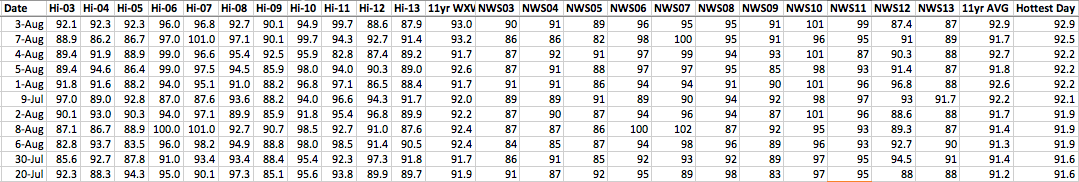
The top 10 average hottest days in BHM
What do we think we know?
- It will be HOT and HUMID in Alabama.
- The truth is our summers vary based on a variety factors. Like we learned the past few years, some summers will be more moderate than others while a few years before that it was exceptionally warm.
- Based on the information we have experienced for the past 10+ years, we should reach our peak heating about August 1 and then start cooling from there, even though it won’t FEEL like it until probably late September.
- But as all of us know, your experience may vary. Summer is subject to change with or without our consent. STAY COOL!
I hope you enjoyed this article. If you have any questions or comments about it, please contact me at http://www.facebook.com/weatherwalrus